When designing graphics for your display products, the colours that you choose can make or break the design.
The right colours can ensure that your message stands out from the crowd, whilst complementing your brand and adding a touch of professionalism. The question is: where do you start? We think that you should consider the 3 following factors:
 1. What colour is your logo?
Your company logo will inevitably be a key feature of the display. It could also be the starting point with which to base the colour scheme on. For example, our logo is blue, grey and white, as we know that these colours work well together. We have also selected a background image that complements them, forming a good solid foundation for the banner stand design. We would then add appropriately coloured text – neutral colours such as grey and black, along with an accented colour picked out from your logo can look very effective.
2. Wher e is your display product going to be used?
Where your display products are going to be used should determine the background colours that your product will use in order to stand out. If you have an advertising flag which is going to be seen against a blue sky or a white marquee, then avoiding white or blue will ensure that it stands out as much as possible. The same applies if your display is going to be in front of a white wall. This outdoor banner does really well to jump out from its surroundings.
3. Complim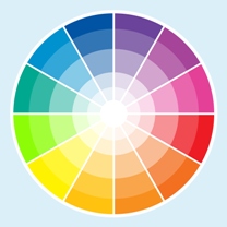 entary colours
Choosing complementary colours might seem obvious, and many people already intuitively choose colours that complement each other. But, if you are like me and you need a little bit of assistance, then a colour wheel can be a great help. Three colours next to each other on the colour wheel can work really well together; with one colour acting as the dominant colour whilst the others can be used as accent colours. Colours opposite each other are considered complementary, and whilst clashing colours can be used, they must be used carefully.
If you would like any advice we would be happy to help.
